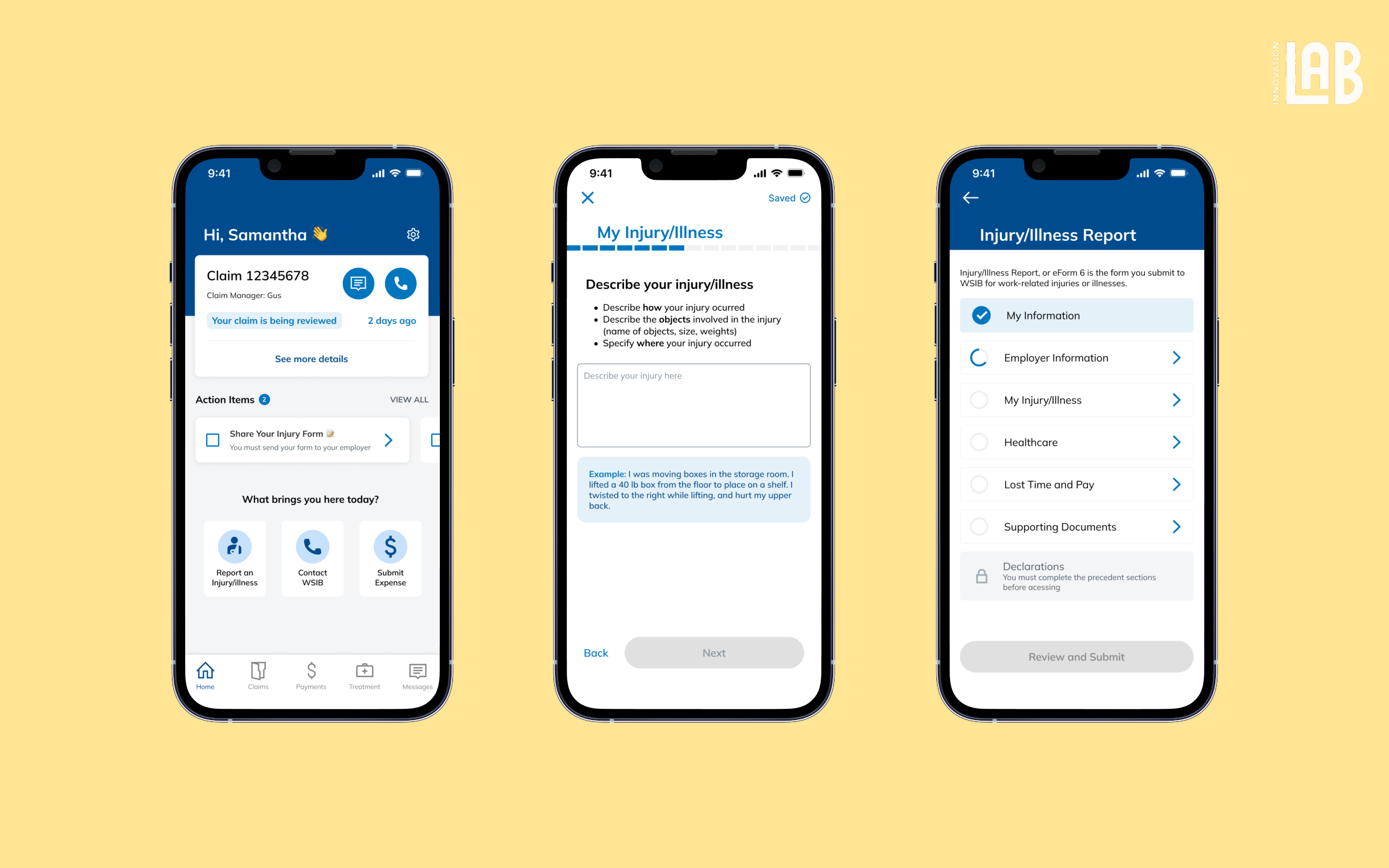
SLA Status Redesign

YEAR

May - Aug 2024

ROLE

UX Designer

Company

Arctic Wolf

table of contents
TLDR

Redesigning the SLA status within the portal dashboard to drive timely security risk remediation.

The Problem

Teams are procrastinating on remediating risks.

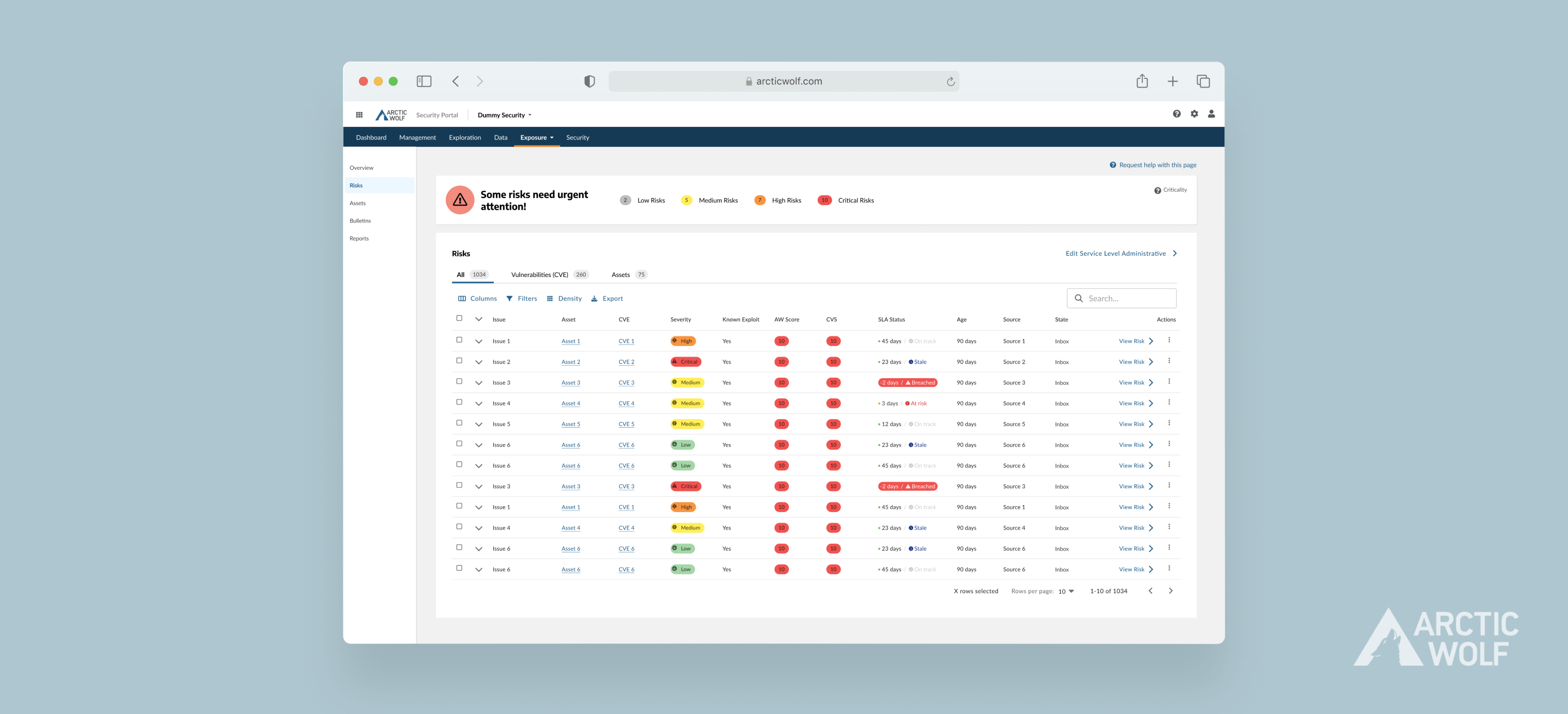
Data showed declining resolution of low-severity risks, which accumulated into urgent last-minute tasks. I recommended modifying SLA status indicators first, leveraging their association with urgency to drive action.

My Role

Led a two-week end-to-end redesign of SLA status.

  • collaborated with IT specialists, customer service reps, developers, and my supervisor
  • the end-to-end design process, from research through to wireframes and interaction flows.
Product

The counting days sets the deadline while recommended actions are given based on the severity level or latency of the risk.

Discovery

SLA statuses hold ambuiguity; categorical but no action cue.

I interviewed Information Architecture Engineers and Cybersecurity Analysts to gain a simplified understanding of the triage process—how risks are characterized and information is entered into the table. They expressed a preference for more quantitative labels, which provide specific and clearer direction.

Users become desensitized to the alertness of color.

The current dashboard clearly has an overwhelming amount of color that lacks hierarchy and may not meet accessibility standards. This led me to restructure the color coding and iconography for each severity level and propose a design system change. For starters, it was best not to rely on color alone.

[insert image of dashboard]

How I Got Here

Suggesting a restructured color legend for better readability and accessibility to the design team.

I revisited the existing colors used in the design system and made suggestive changes to have clear correspondence with each severity level. I presented this to the design team and received positive feedback. Beyond color, present severity through visual weight and typography hierarchy.

Introduced latency urgency that would motivate action.

What caught my attention was how some risks may not seem urgent initially, but if ignored, could have compounding business impact. I decided to leverage this insight by conducting additional user research to understand different risk scenarios and how they can be urgent without directly compromising security. For example, employee access issues or customer-facing bugs.

User Feedback

Overlapping label meanings and still too much color.

  • Some labels had similar meanings that didn't distinguish the difference
  • It wasn't immediately understood what the colored dot meant
  • Readability issues with the gray constrast

Final Decisions

Adding weight with the pill encapsulation.

  • the more the pill encapsulates, the higher the weight

Easy distinguishing in 3 ways: color, icon, and text

  • on track matches the rest of the table so it intentionally blends in and doesn’t draw unnecessary attention
Setbacks

Losing the full picture when scoping to a feature for a specific problem.

The deadline of the project didn't give me enough time to learn its purpose within the context of the entire dashboard and the broader system. Although I addressed the immediate problem, it may cause disruption for other flows in the future.

Impact
Learnings

NEXT PROJECT