
API, Web, E-commerce
Simflection Virtual Try-on
Take a peek

YEAR
ROLE
Company
For workers in Ontario, filing a WSIB claim is the first step toward receiving compensation and medical support related to the injury sustained at work. But the process is anything but seamless.
We're abandoning the old-school ways and transitioning into a digital age, especially with our smartphones. 56% of WSIB web traffic comes from smartphone users aged 16–44, the same group that represents 55% of injury report submissions.
And they're already behind the trend. Two Canadian worker compensation boards (Alberta and BC) have already expanded their services with mobile apps since 2014. WSIB is not accommodating for the largest provincial population in Canada.
This archaic system is consuming time and money. With 80% of the system still running on the organization’s internal infrastructure rather than on cloud, it makes data delivery slower and more costly.
We conducted secondary research through online forums and blogs to learn more about the user's experience.
[Affinity chart]
Injured workers spend countless hours navigating a complex process, delaying their recovery and impacting their ability to return to work and financially support themselves and their families.
To answer these questions, we'll need to conduct user research to gather raw data that can pinpoint the reasoning for the problem.
After 10 user interviews, we synthesized all findings and categorized them into 3 emerging themes that highlighted the gaps they experience.
.png)
Using insights from our research, we mapped out every stage an injured worker would experience in working with WSIB, surfacing all of the low points.
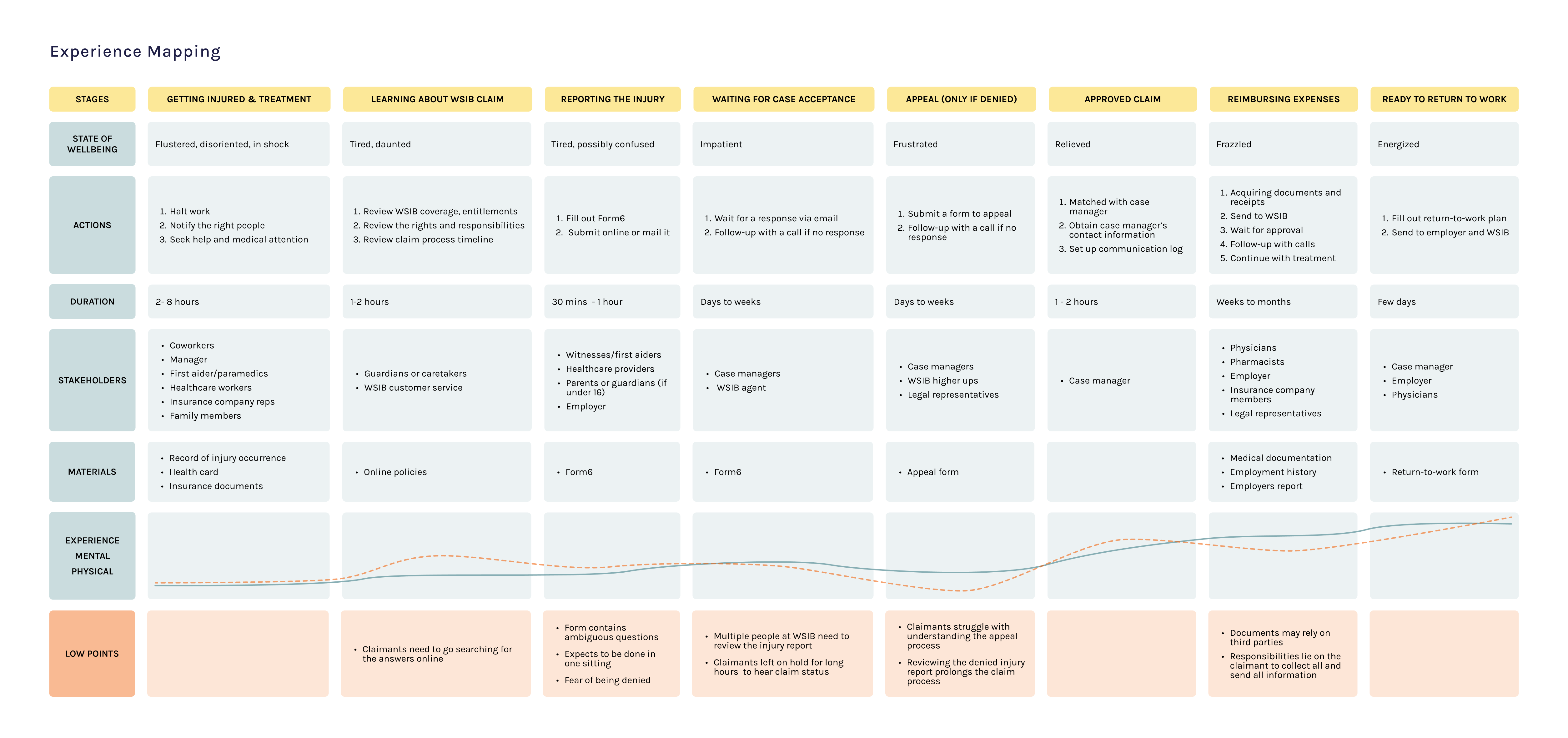
It’s clear that injured workers face significant challenges throughout the claims process. Even small missteps can snowball into major delays in already time-sensitive cases. This means the mobile app should act as a personal assistant, staying on top of what the claimant has done, what still needs to be done, and how to do it effectively. It should alleviate the low points by reducing cognitive load, physical strain, stress, and overall workload for injured workers.
It became imperative to create realistic personas that represent users who struggle with the claims process. These personas can help anchor our design decisions and ensure we're addressing real pain points, especially given the wide diversity of user needs in this context.
[persona 1 2 3]
To set a strong foundation for WSIB’s first mobile app, we conducted a competitive analysis of other compensation boards and insurance providers. The goal was to understand how they presented their claim processes, guide users through complex procedures, and deliver support within the mobile platform.
[comparative matrix]
WSIB is a temporary and conditional experience. Once injured workers recover and remain injury-free, they typically won’t interact with the system again. During the short time they do, the experience must be smooth, supportive, and easy, ensuring it doesn't exacerbate the challenges they’re already facing.
Claimants like the synchronous support they get from the calls (as confirmed from user research) but the important information can be easily drowned out. Trying to remember from memory recall is quite hard for someone who's already dealing with a lot [research to back this up]. This then loops into their time being wasted on waiting to get back on call. So why not relieve that burden?
Before: call with case manager → taking notes while calling → call ends → claimants tries to remember tasks or anything they’ve missed → details fade quickly or notes misplaced→ missed steps lead to a follow-up call → frustrations from long waits and low confidence on completing it on their own
After: call with case manager → claimants intently listen → call ends → notification is received → sees summary upon tapping → clear timestamped checklist → tasks tracked in app → clarity, ownership and reduced anxiety
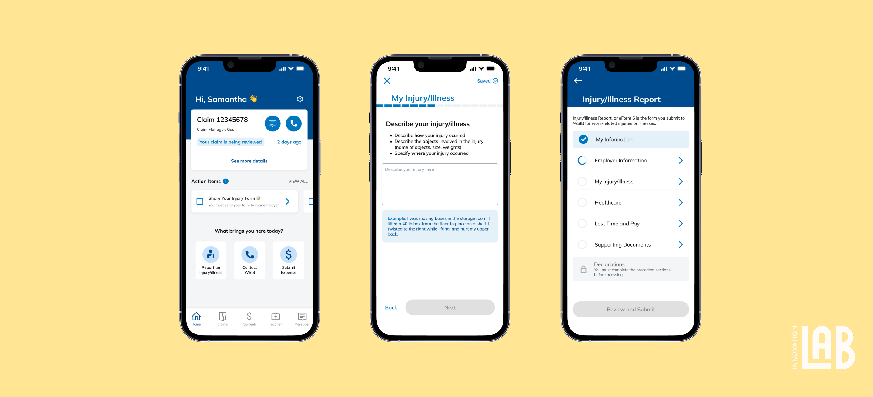
Whether starting fresh or returning to a claim, users are guided to the right next step without pressure. Clear actions and supportive cues help them report injuries confidently, not reactively.
.gif)
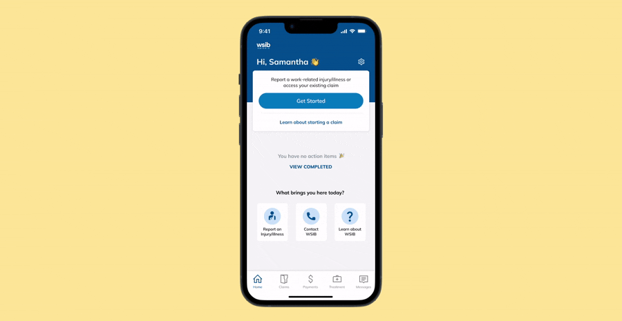
We brought clarity to the forefront by surfacing real-time claim status and personalized action items directly on the home screen. With clear deadlines, progress updates, and contextual nudges, users stay informed and in control without needing to navigate through confusing menus or wait on a call.
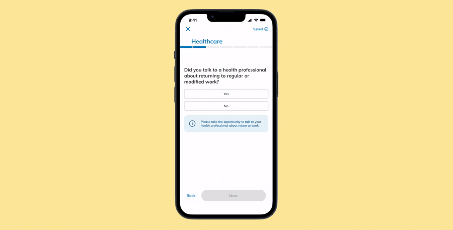
For many users, especially immigrants unfamiliar with the system, injury claims can feel intimidating, confusing, or full of hidden expectations. We introduced info cards as gentle, in-context guidance throughout the form. These cards clarify intent, explain unfamiliar terms, and encourage proactive next steps. This helps users complete forms accurately and confidently, no matter their background or level of familiarity.
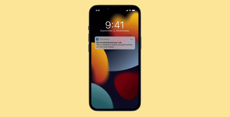
After a call with a case manager, it’s easy to forget what was said especially when you’re injured or overwhelmed. We built a feature that summarizes the conversation and converts into action items. Claimants receive a notification to review, confirm, and even add their own notes to create a record that builds trust and drives follow-through.
Due to the time and budget constraints, we conducted usability testing with internal team members and family members, both moderated and unmoderated tests.
Thanks for stopping by! Please come back soon~


© Made by Yan through countless solo jamming sessions