Mobile, App, Insurance
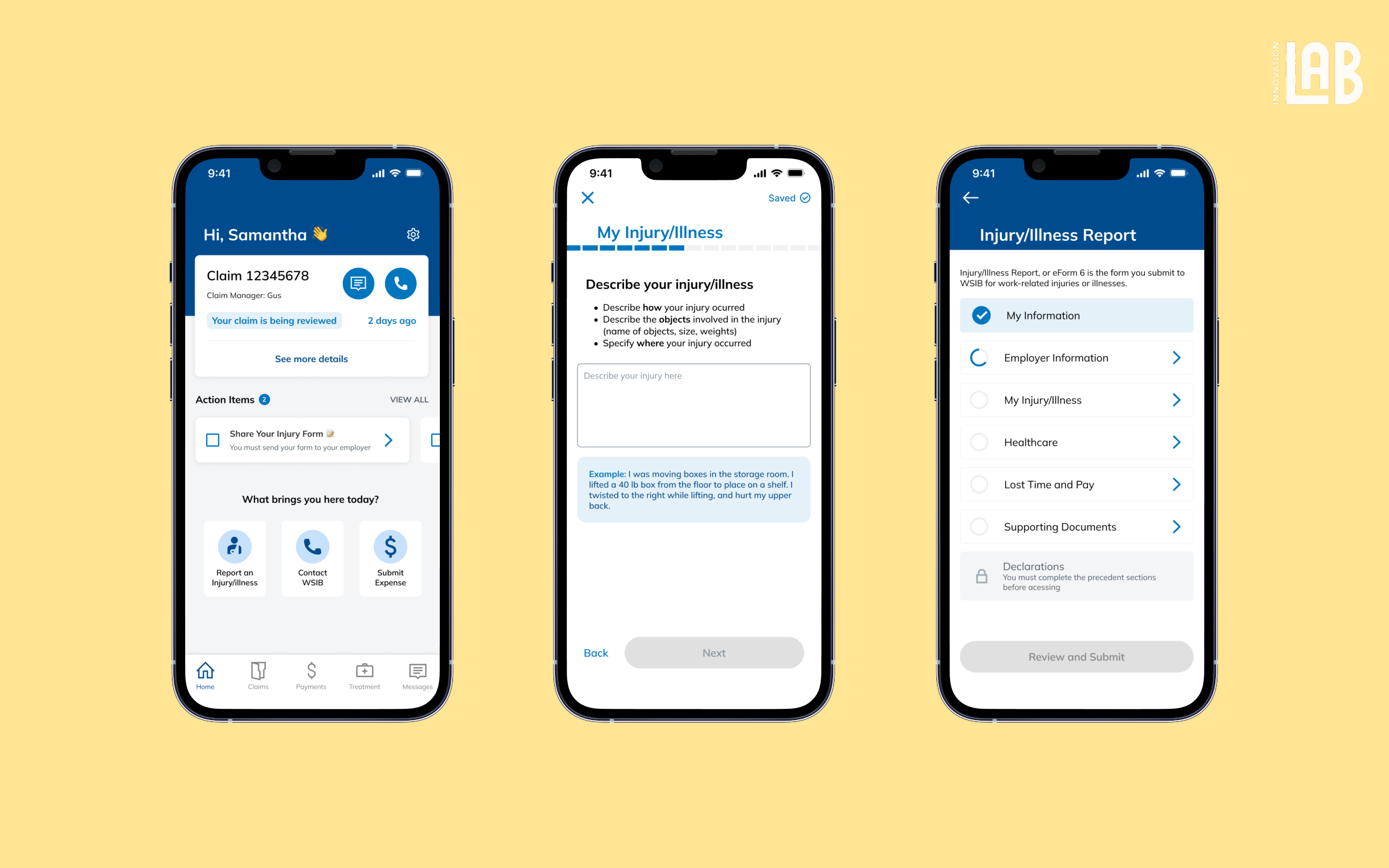
WSIB Mobile App for Claim Tracking
Take a peek

YEAR
ROLE
Company
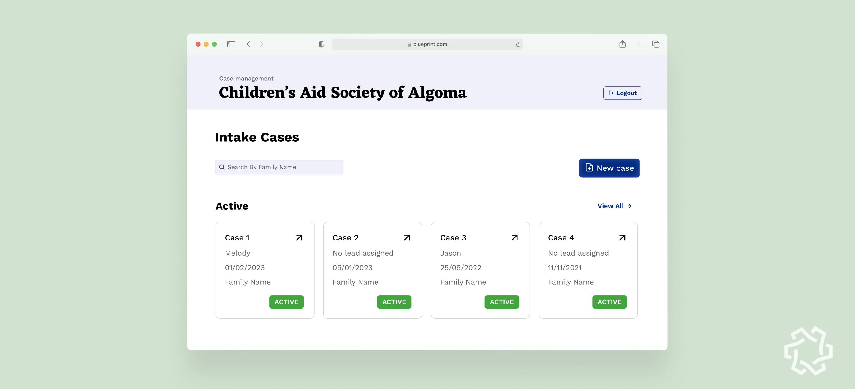
The Supervised Access Program (SAP) helps children in vulnerable situations maintain relationships with their parents—offering a safe, structured space overseen by CAS clinicians.
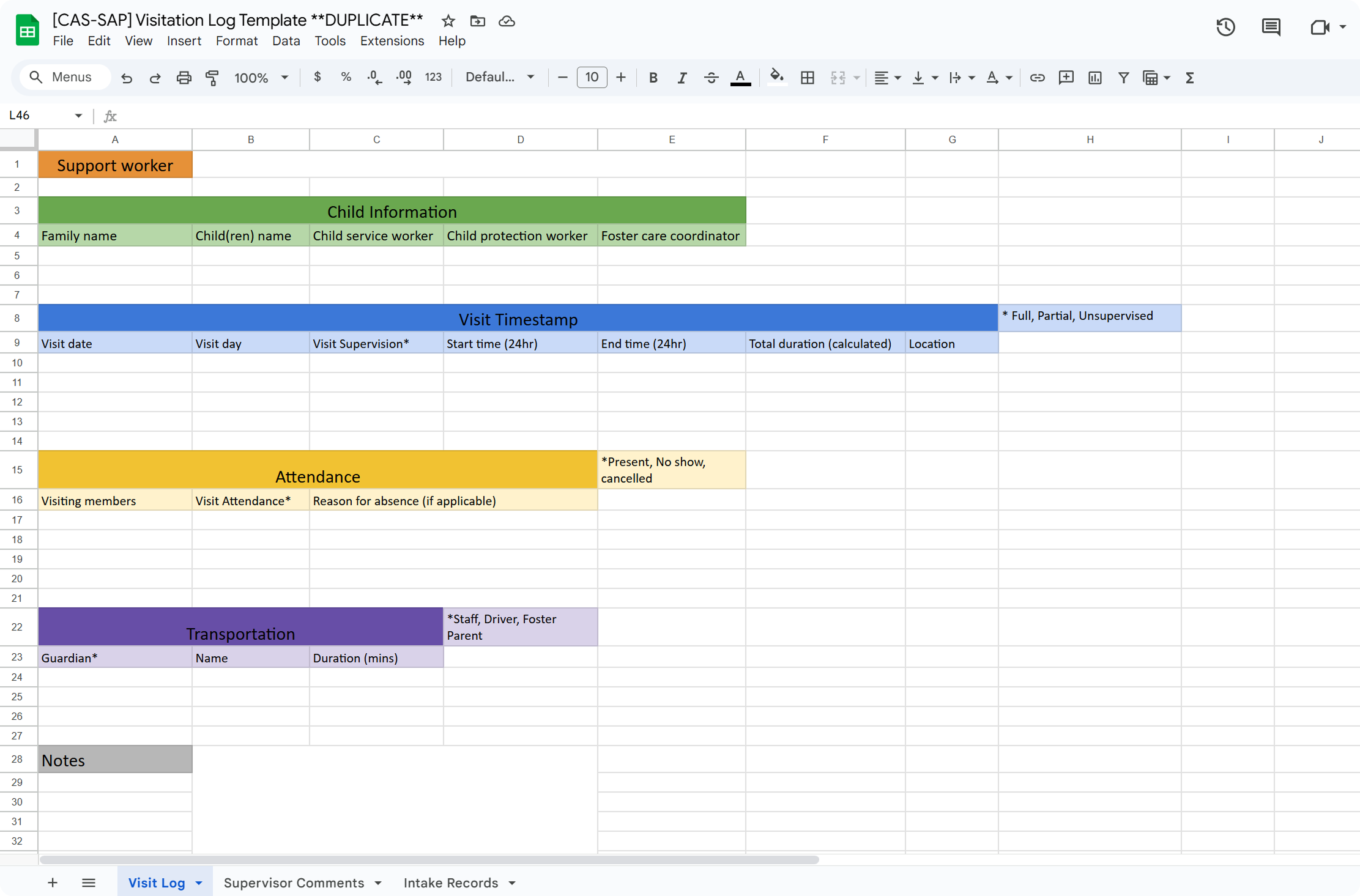
But before a child can access this care, clinicians must chase down scattered case files across two separate Google Drives. With no centralized system, even a single case requires navigating spreadsheets, opening multiple tabs, and manually piecing together information.
This administrative tangle not only drains clinicians’ time—it delays access to critical support for children who need it most.
The current workflow was patched together out of necessity. For clinicians, especially older volunteers with limited tech confidence, managing these fragmented spreadsheets feels more like detective work than support work.
This opens a meaningful opportunity:
To rethink how information is logged, accessed, and updated—not just to improve efficiency, but to reduce cognitive strain and restore focus to human care.
Our high level goals were to:
I joined the project in its final four months, stepping in as the lead product designer during the most critical phase: tying together fragmented pieces into a cohesive, usable system.
Working alongside a junior designer whom I mentored, I led the end-to-end design of four key workflows that clinicians would rely on daily.
I collaborated closely with project leads and developers to ensure these workflows not only met functional requirements, but felt intuitive for users who were often overwhelmed by digital tools.
Since this wasn’t a blank slate, I started by auditing the existing work from the previous design cycle. My goal was to maintain continuity while identifying areas that needed refinement or deeper user understanding.
I collaborated closely with the PM to translate the client’s high-level feature requests into focused design tasks.
To truly understand the pain points behind these requests, I proactively joined client calls and feedback sessions.
In every team, there was always one person everyone turned to when something got lost. Not because the system helped them find it, but because they had memorized the maze. That person was the real product. The people had to adapt the system and develop their own logic for navigating it that make it feel manageable.
The deeper insight wasn’t just that the system was inefficient, it was that clinicians were carrying the system in their heads, and that’s where breakdowns began.
"The sheet doesn't really guide me, I just know where things are because I've done it so many times." — senior Clinician
The discovery revealed that Clinicians were overwhelmed by the complexity and compensating for it. They improvised personal workarounds, carrying the system in their heads because the product didn’t carry it for them.
That shifted our focus.
We needed to redesign how confidence, coordination, and context could be built into the tool itself.
How might we externalize clinicians’ mental models and create a shared, flexible system they can trust—without needing to memorize it?
.gif)
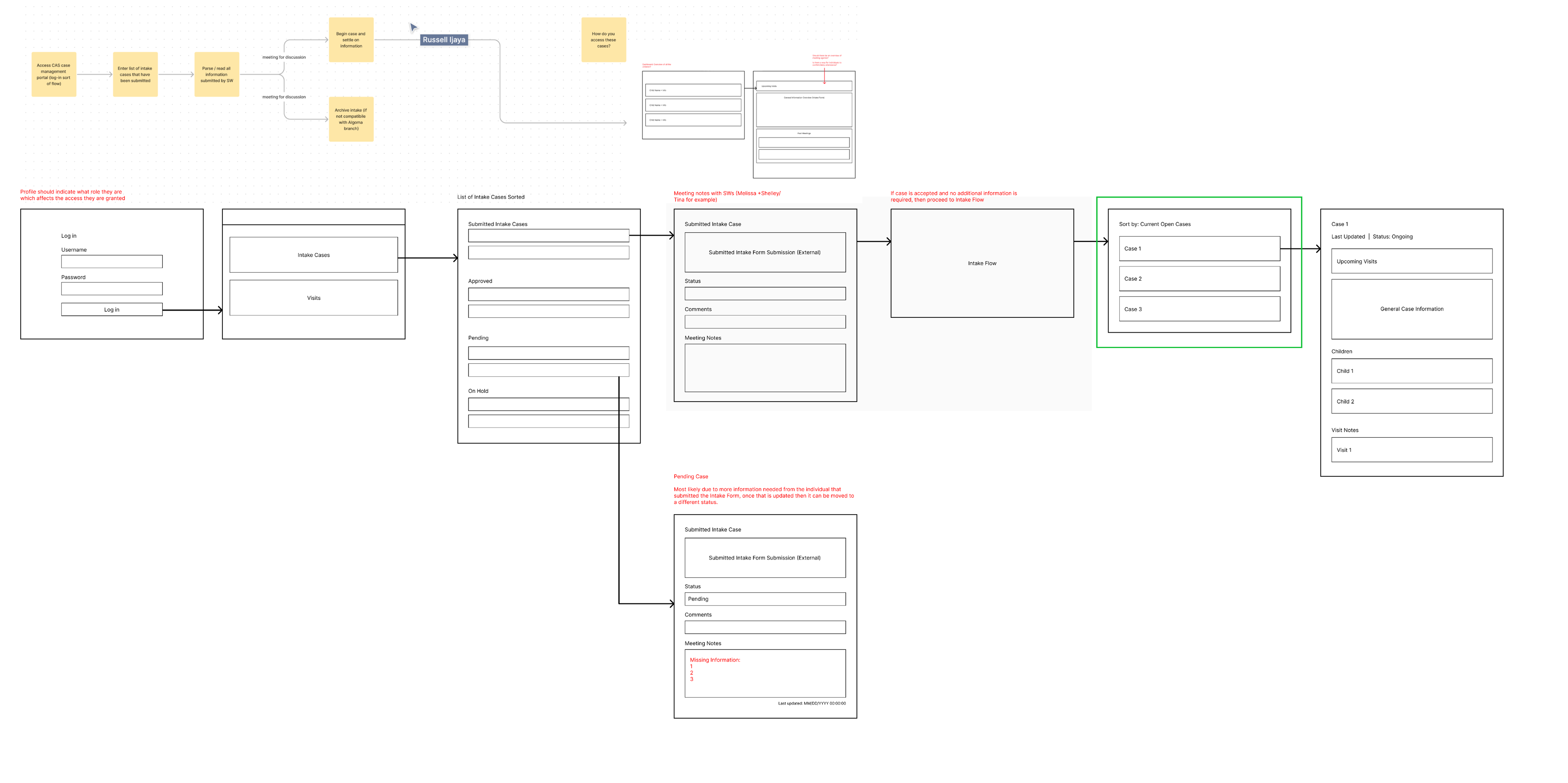
Managing dozens of active cases is already complex. I introduced quick-sort filters and a glanceable summary system that streamline discovery and reduce time-to-context.
Whether a clinician wants to see what’s due next or prep for upcoming visits, the system adapts with one click. Combined with the summary banner, it helps users onboard efficiently.
.gif)
Lightweight, in-context modals let clinicians take immediate action from anywhere in the dashboard. They reduce navigation overhead, streamline common workflows, and maintain context, especially valuable for busy staff working across multiple cases at once.
To move past surface-level fixes, I leaned on two frameworks: Jobs to Be Done and System Mapping.
System Mapping exposed how information flowed between tools and people, and where the critical failure points were.
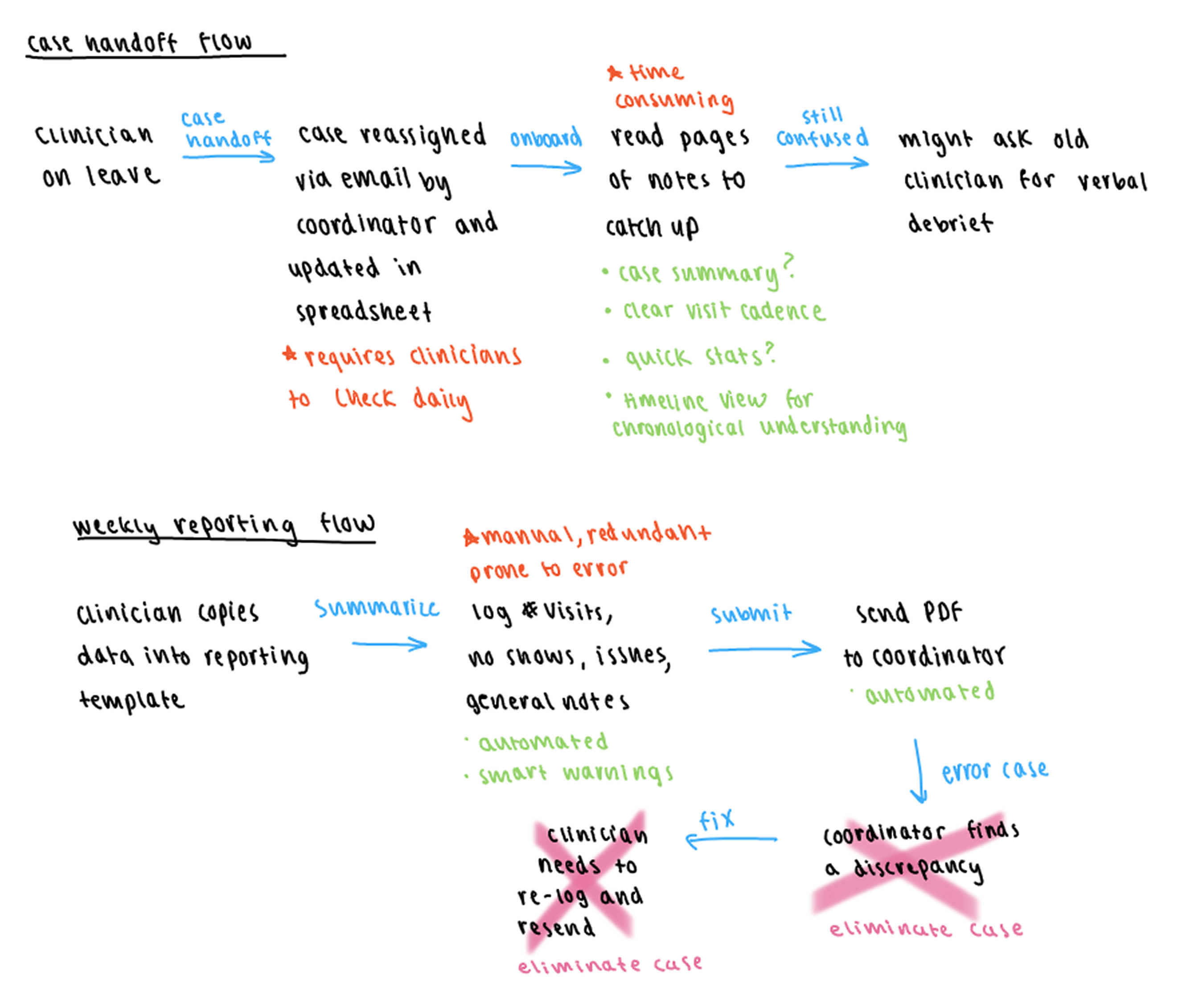
At the same time, I used Jobs To Be Done to uncover what clinicians really wanted to achieve. It helped shift the focus from logging activity to building peace of mind, seamless handoffs, and clarity in a high-stakes environment.
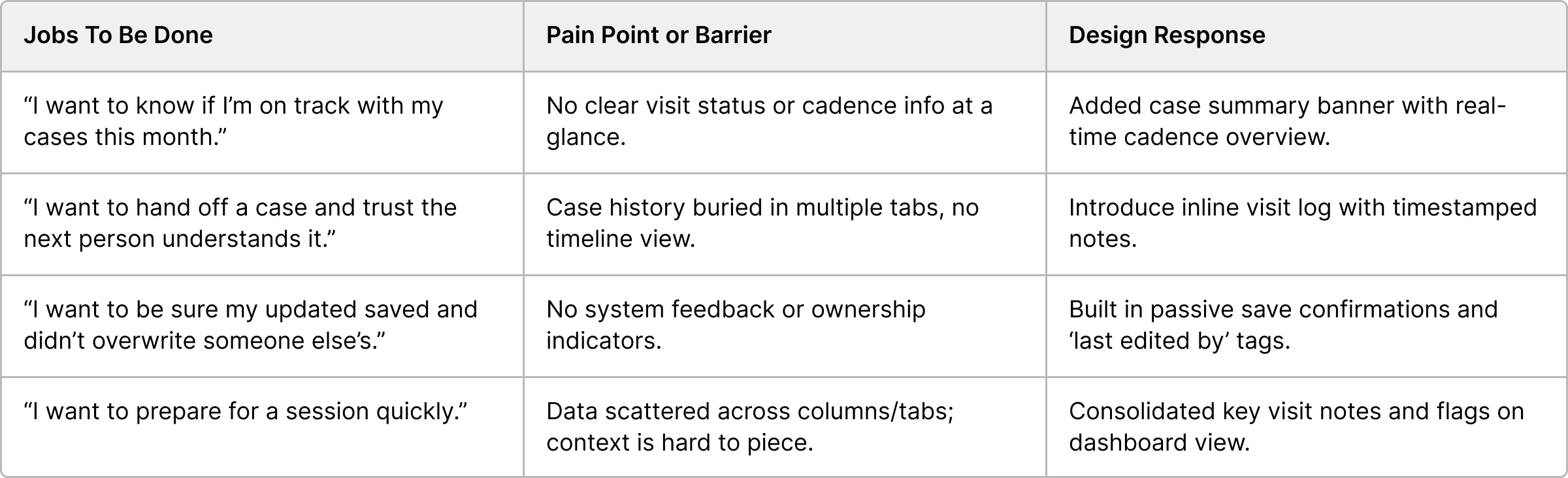
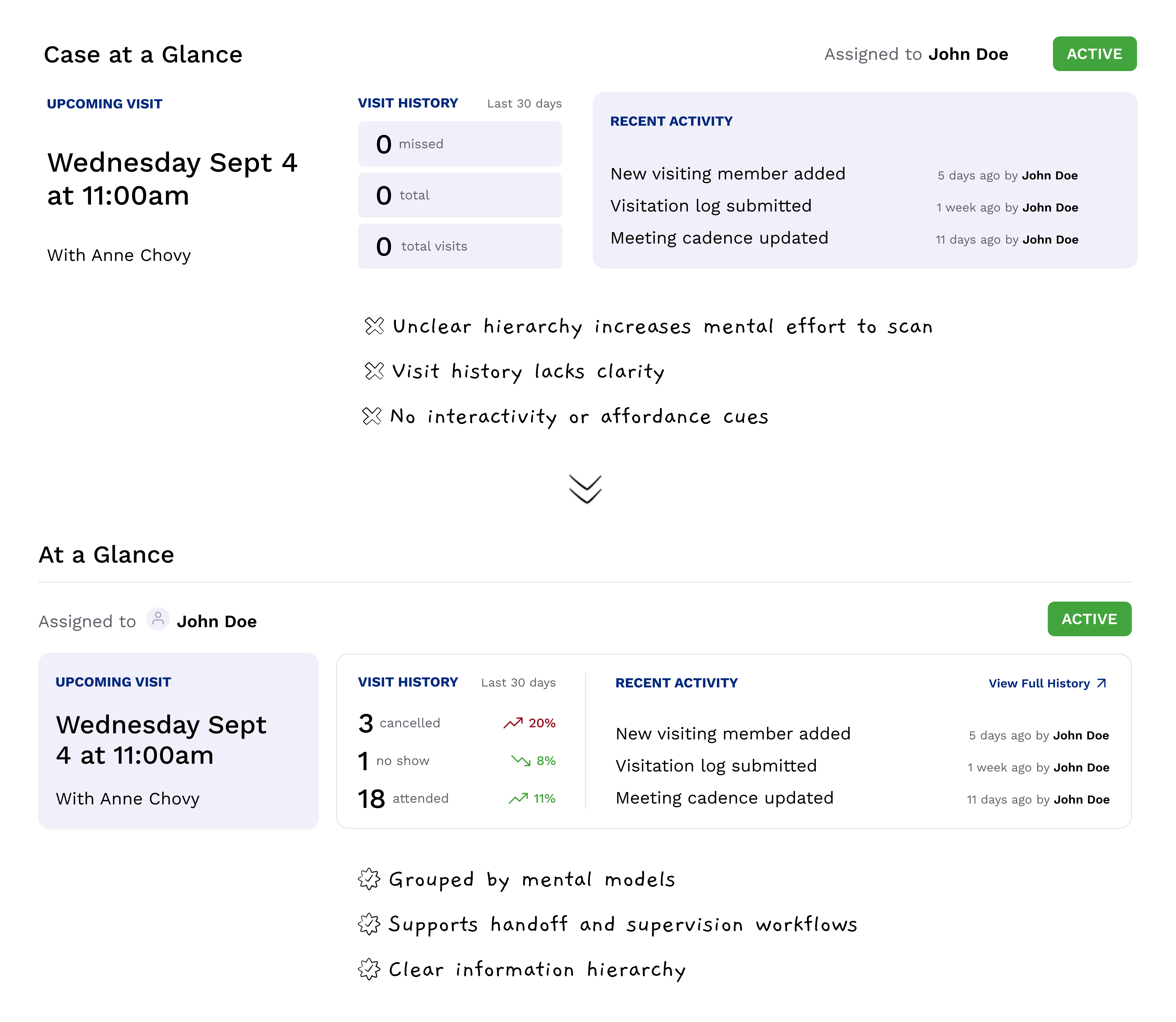
The spreadsheet treated every data point as equal. For clinicians managing multiple cases, this meant critical issues were buried in a sea of neutral data. What the system desperately needed was clarity at a glance.
We introduced a case summary banner that surfaced exactly what clinicians needed to see first: cadence progress, upcoming visits, missed sessions, and a clear case status. In testing, clinicians immediately gravitated toward it.
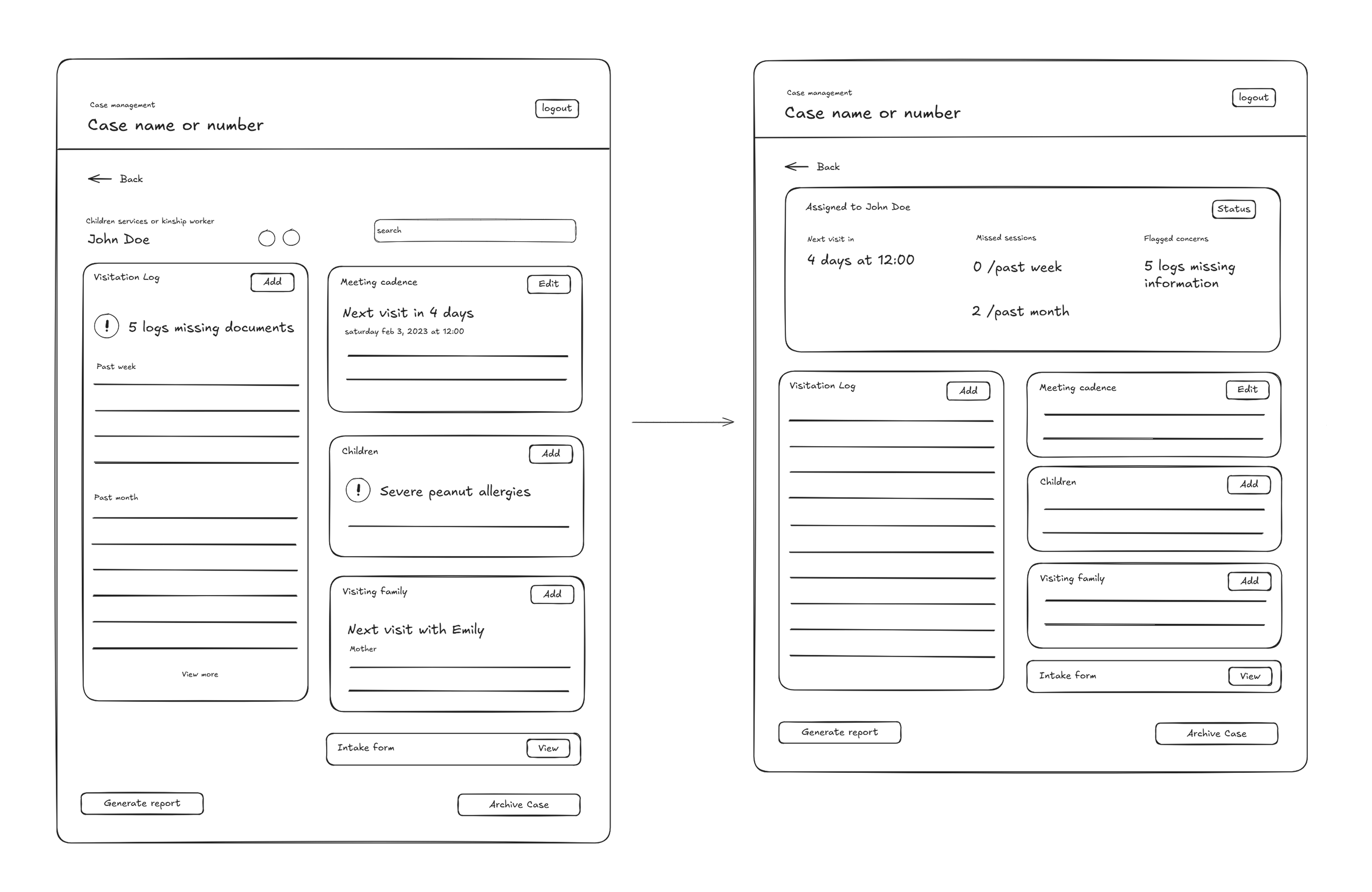
4 out of 5 said it made them feel more in control of their caseload, and it became a natural anchor for daily check-ins.
This changed how users engaged with the entire system. It took what was previously hidden work and made it visible and actionable.
After finalizing the core workflows and prototypes, I handed off the design to development team for implementation. Throughout the build phase, I worked closely with them to ensure edge cases were accounted for, transitions were smooth, and micro interactions supported the system’s intent.
Although our term ended before the system was formally adopted by the organization, usability testing with clinicians showed promising improvements in both speed and confidence.
Compared to the previous spreadsheet setup, users completed core workflows 40% faster, with fewer back-and-forth checks and a significantly lower cognitive load.
Finding records for a child is more linear and makes a lot of sense now. - Beta Tester, SAP program
Onboarding also saw marked improvement. New clinicians were able to complete core tasks 30% faster than baseline testers using the old system.
The biggest shift? Clinicians no longer had to remember how the system worked. They could trust that it would support them.

Thanks for stopping by!


